Abstract:
Major League Baseball has a rich and storied history. Here are the top 10 most memorable regular season performances by baseball clubs en route to the playoffs.
Major League Baseball can point to its rich and storied history, which dates to before the first World Series in 1903. Over the years, a number of baseball clubs have gained fame for their memorable regular-season performances en route to the playoffs. Some of these teams made history because they overcame long odds to reach the postseason. Other squads are remembered because they dominated the competition on their way to the playoffs.
Here are the top 10 most memorable regular-season performances by baseball clubs en route to playoff appearances:
1. New York Yankees, 1998: The Yankees set an American League record by winning 114 games in the regular season. Yankees fans had much to be proud of that year, as their team would go on to win the World Series.
2. Tampa Bay Rays, 2011: The Rays were nine games behind the American League wild-card leader--the Boston Red Sox--as late as September and looked to be out of the postseason hunt. Instead, the Rays became the first club in Major League Baseball's history to overcome a nine-game deficit in September to reach the playoffs. The Rays clinched the wild-card berth on the final day of the season. The team did it in grand fashion by coming back from seven runs down to beat the New York Yankees 8-7 in extra innings.
3. Chicago Cubs, 1906: The Cubs finished the 1906 regular season with 116 wins and 36 losses. No major league team since that time has topped the Cubs' .763 winning percentage. Unfortunately, the Cubs could not parlay that tremendous regular season record into postseason success. The club lost the World Series to its crosstown rival, the Chicago White Sox.
4. St. Louis Cardinals, 2011: Most people who took a look at the major league standings on Aug. 25, 2011, probably thought that the Cardinals' season was over. At that time, the team was 10.5 games behind the Atlanta Braves for the National League's wild-card spot. Amazingly, the Cardinals would go on to win 23 of their last 31 games and secure a ticket to the playoffs (and eventually win the World Series).
5. Seattle Mariners, 2001: The Oakland Athletics capped off a superb year in 2001 by winning 102 games. However, the team finished an amazing 14 games behind the first-place Seattle Mariners. The Mariners set an American League record by winning 116 games.
6. Boston Braves, 1914: The Braves had finished 31.5 games behind the league winner in 1913. The team seemed to be heading for a similar fate in mid-July 1914. The club was ranked dead last in the National League. The Braves would go on an amazing run during the latter part of the season to win both the league pennant and the World Series.
7. Colorado Rockies, 1995: The club played its first major league game in 1993. The Rockies made it to the playoffs in the 1995 season. No other expansion club up to that point had reached the playoffs in such a short time span.
8. Arizona Diamondbacks, 1999: Under manager Buck Showalter, the Diamondbacks made history by reaching the playoffs in only the club's second year in existence.
9. New York Mets, 1969: In previous seasons, the Mets had been the epitome of a bad team. Few people expected the club to do anything of note in 1969. The Mets surprised everyone by winning 100 games and making the playoffs for the first time in franchise history. The squad was not done. It went on to win the World Series in that year.
10. Montreal Expos, 1981: Fans of the Expos were ecstatic when the team made its first and only appearance in the playoffs in 1981. Perhaps the club, now called the Washington Nationals, will secure its second postseason berth ever in 2012.
Sources:
Major League Baseball's official website
Baseball Reference
The author has been following Major League Baseball since he was a child and is a fan of the Atlanta Braves.
-- Anthony Hopper
#baseball #MLB #history #sports #sportshistory #baseballhistory #Braves #Mets #Expos #Mariners #playoffs #Cardinals #Cubs #Rays #Yankees
Sunday
NFL Stadium Guide: Carolina Panthers (Written in 2012/2013)
Abstract:
This stadium guide provides fans of the Carolina Panthers with pertinent information on Bank of America Stadium.
The Carolina Panthers are my second most favorite team behind the Pittsburgh Steelers. I have visited Bank of America Stadium on several occasions to watch the Panthers play football. The stadium is only about a three and half hour drive from my current residence. I love the stadium's design. Regardless of where I sit, I always feel like I have a great view of the field.
I have created a stadium guide for fans of the Carolina Panthers. The guide contains pertinent information on a range of topics related to the team's home stadium.
Stadium Name: Bank of America Stadium
Location: Charlotte, NC (located in downtown Charlotte)
Stadium Dimensions: Bank of America Stadium is approximately a half mile in circumference and 180 feet high from the field to the top of the scoreboard. It is an open air stadium and is divided into three tiers.
Maximum Capacity: 73,778 people
Wheelchair Seating: 1394 wheelchair ready spots located throughout the stadium.
Year Built: 1996
Parking: Fans attending the game can park at a variety of lots and parking garages located near the stadium. The parking fees vary by lot. There are over 30,000 parking spaces located within a mile or so of the stadium.
Handicap Parking: Bank of America Stadium does not have handicapped parking spaces. However, disabled individuals can park in Lot B at the Carolinas Medical Center, located at 1000 Blythe Boulevard. They can then take a shuttle to and from the game. This service costs $20.00 per vehicle.
Rail Service: Fans can park at several locations in Charlotte and ride the LYNX rail service into downtown. At least three of the train stops are within a few blocks of the stadium.
Food: 429 fixed concession stands, located throughout the stadium, offer the standard ballpark foods, including hotdogs, hamburgers, and pizza. I can state from personal experience that the food is pretty good.
Alcohol: The stadium does serve beer. However, the park's vendors will stop selling alcohol at the end of the third quarter.
Prohibited Items: The list is long. It includes, among other things, video cameras, large bags, alcohol, umbrellas, laptops, beach balls, balloons, strollers, and pets. The Panthers also reserve the right to prohibit patrons from bringing banners and signs into the stadium at the team's discretion.
ATM Machines: 8 machines located at various places within the stadium.
Traffic: From experience, I can say that traffic heading to the stadium will be heavy on game days. People need to take this fact into consideration when planning a trip to a Panthers' game.
Sources:
1. Capps, Wayne. (September, 10, 2006). The Bank of America Stadium in Charlotte, N.C. as seen
from the flight deck of a C-17 Globemaster III. Retrieved from Wikimedia Commons. The
photographer/author's photo is in the public domain because it is the work of a U.S. serviceman
taken or made as part of that person's official duties.
The Carolina Panthers' official website
PSL Source
The author's second most favorite team is the Carolina Panthers. He has traveled to Bank of America Stadium several times to watch the Panthers play.
-- Anthony Hopper
#football #NFL #CarolinaPanthers #Carolina #Panthers #stadiums #guide #sports
 |
| The Bank of America Stadium in Charlotte, N.C. (1) |
I have created a stadium guide for fans of the Carolina Panthers. The guide contains pertinent information on a range of topics related to the team's home stadium.
Stadium Name: Bank of America Stadium
Location: Charlotte, NC (located in downtown Charlotte)
Stadium Dimensions: Bank of America Stadium is approximately a half mile in circumference and 180 feet high from the field to the top of the scoreboard. It is an open air stadium and is divided into three tiers.
Maximum Capacity: 73,778 people
Wheelchair Seating: 1394 wheelchair ready spots located throughout the stadium.
Year Built: 1996
Parking: Fans attending the game can park at a variety of lots and parking garages located near the stadium. The parking fees vary by lot. There are over 30,000 parking spaces located within a mile or so of the stadium.
Handicap Parking: Bank of America Stadium does not have handicapped parking spaces. However, disabled individuals can park in Lot B at the Carolinas Medical Center, located at 1000 Blythe Boulevard. They can then take a shuttle to and from the game. This service costs $20.00 per vehicle.
Rail Service: Fans can park at several locations in Charlotte and ride the LYNX rail service into downtown. At least three of the train stops are within a few blocks of the stadium.
Food: 429 fixed concession stands, located throughout the stadium, offer the standard ballpark foods, including hotdogs, hamburgers, and pizza. I can state from personal experience that the food is pretty good.
Alcohol: The stadium does serve beer. However, the park's vendors will stop selling alcohol at the end of the third quarter.
Prohibited Items: The list is long. It includes, among other things, video cameras, large bags, alcohol, umbrellas, laptops, beach balls, balloons, strollers, and pets. The Panthers also reserve the right to prohibit patrons from bringing banners and signs into the stadium at the team's discretion.
ATM Machines: 8 machines located at various places within the stadium.
Traffic: From experience, I can say that traffic heading to the stadium will be heavy on game days. People need to take this fact into consideration when planning a trip to a Panthers' game.
Sources:
1. Capps, Wayne. (September, 10, 2006). The Bank of America Stadium in Charlotte, N.C. as seen
from the flight deck of a C-17 Globemaster III. Retrieved from Wikimedia Commons. The
photographer/author's photo is in the public domain because it is the work of a U.S. serviceman
taken or made as part of that person's official duties.
The Carolina Panthers' official website
PSL Source
The author's second most favorite team is the Carolina Panthers. He has traveled to Bank of America Stadium several times to watch the Panthers play.
-- Anthony Hopper
#football #NFL #CarolinaPanthers #Carolina #Panthers #stadiums #guide #sports
Friday
Top 25 Worst Looking Uniforms Worn by Pro Sports Teams in Years Past (Written in 2012)
Abstract:
This article provides a brief description of 25 of the worst looking uniforms that have been worn by professional sports teams in baseball, basketball, football, and hockey. All of these outfits have been retired.
I have had the chance to view countless sports uniforms in person, on television, and on news sites. Most of the time, I like what I see. However, I occasionally espy an outfit that should never have made it out of the drawing room.
Here are 25 of the worst uniforms ever created for a professional sports team (in baseball, basketball, football, and hockey).
Thankfully, many of these outfits have not seen the light of day in decades.
1. Green Bay Packers' Blue and Yellow, 1929: I have to agree with the masses on this one. The blue uniform with the yellow circle in its middle is downright ugly.
2. Minnesota North Stars' Green, Gold, and White, 1967: The version of this uniform with a tie-up collar is truly hideous.
3. Houston Astros' Multi-color, 1975-1979: The team struck out when it created this monstrosity. The color scheme is awful.
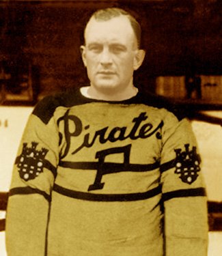
4. Pittsburgh Pirates' Yellow with Black Lines, 1925-1928: The hockey jersey's color and design are both atrocious.
5. Chicago Staleys' Blue and Yellow, 1921: The uniform that the Staleys (now the Chicago Bears) wore for the 1921 season does the vertical stripe an injustice.
6. Cleveland Cavaliers' Red and Gold, 1981-1984: This uniform is in the wrong place at the wrong time.
7. Vancouver Canucks' Yellow, Red, and Black, 1978-1985: The "V" on this uniform does not stand for victory. The color scheme is atrocious.
8. Providence Steam Roller's Black and Orange, 1928: This football team did not last long and neither did its uniform.
9. Pittsburgh Pirates' Gold with Black Stripes, 1933-1934: The Pirates were the forerunners of the NFL's Pittsburgh Steelers. This is one uniform that does not look good in stripes.
10. Seattle Mariners' Blue and White, 1977-1981: This home uniform gets two thumbs down from me. The color scheme is bad, but the logo is even worse.
11. Chicago Blackhawks' Tan, Red, and Chocolate, 1935-1937: The pattern and colors might be great for a throw rug but not for a hockey uniform.
12. Chicago White Sox's Red, White, and Blue, 1984: This uniform is great--for laughs.
13. Philadelphia 76ers' Blue with White Lettering, 1966-1970: Some uniforms achieve perfection by keeping things simple, but not this one.
14. Iowa Barnstormers' Black and Gold, 1995-2000: Some people might be fond of the various logos imprinted on the Arena League team's uniform. I find them to be kind of tacky. The organization apparently agrees with me. It removed the wings and helicopter propeller from the outfit in 2008.
15. Montreal Maroons' White and Maroon, 1935-1938: This hockey uniform may have been stylish in the 1930s, but it receives a poor grade from me.
16. Boston Red Sox's Red and White, 1907-1910: The color scheme is OK. However, the stocking in the chest area is an epic fail.
17. Hamilton Tigers' Yellow and Black Stripes, 1920-1921: Yet another team that commits a uniform faux passé by choosing a poorly considered striped pattern.
18. Washington Redskins' Red, White, and Brown, 1948: The reddish top does not go well with the yellowish-brown pants.
19. Chicago Cardinals' Brown and Red, 1921-1922: This uniform's red and brown color scheme is drab and unimaginative. The pants come up a bit too high as well.
20. St. Louis Blues' Red and Blue, 1995-1998: Blue and red do not always go well together.
21. Washington Nationals' White, 1924: Where are the colors?
22. Washington (Bullets) Wizards' Blue, Red, and White, mid-1980s: This one is a dud.
23. Colorado Rockies' Blue, Yellow, and Red, 1977-1982: Colorado was once home to an NHL team called the Rockies (now the New Jersey Devils). The squad's home uniform leaves something to be desired.
24. Montreal Allouettes' Red and White, 1946-1969: This uniform does not score many style points with me.
25. Toronto Argonauts' White with a Touch of Blue and Black, 1976-1988: The Argonauts' away uniform is a yawner.
Sources:
The Grid Iron Uniform Database
NBA.com
The Hockey Uniform Database
The author is an avid sports fan. His favorite teams are the Pittsburgh Steelers (in football) and the Atlanta Braves (in baseball).
-- Anthony Hopper
#sports #sportshistory #history #baseball #MLB #football #NFL #basketball #AFL #NBA #hockey #NHL
I have had the chance to view countless sports uniforms in person, on television, and on news sites. Most of the time, I like what I see. However, I occasionally espy an outfit that should never have made it out of the drawing room.
Here are 25 of the worst uniforms ever created for a professional sports team (in baseball, basketball, football, and hockey).
Thankfully, many of these outfits have not seen the light of day in decades.
1. Green Bay Packers' Blue and Yellow, 1929: I have to agree with the masses on this one. The blue uniform with the yellow circle in its middle is downright ugly.
2. Minnesota North Stars' Green, Gold, and White, 1967: The version of this uniform with a tie-up collar is truly hideous.
3. Houston Astros' Multi-color, 1975-1979: The team struck out when it created this monstrosity. The color scheme is awful.
4. Pittsburgh Pirates' Yellow with Black Lines, 1925-1928: The hockey jersey's color and design are both atrocious.
5. Chicago Staleys' Blue and Yellow, 1921: The uniform that the Staleys (now the Chicago Bears) wore for the 1921 season does the vertical stripe an injustice.
6. Cleveland Cavaliers' Red and Gold, 1981-1984: This uniform is in the wrong place at the wrong time.
7. Vancouver Canucks' Yellow, Red, and Black, 1978-1985: The "V" on this uniform does not stand for victory. The color scheme is atrocious.
8. Providence Steam Roller's Black and Orange, 1928: This football team did not last long and neither did its uniform.
9. Pittsburgh Pirates' Gold with Black Stripes, 1933-1934: The Pirates were the forerunners of the NFL's Pittsburgh Steelers. This is one uniform that does not look good in stripes.
10. Seattle Mariners' Blue and White, 1977-1981: This home uniform gets two thumbs down from me. The color scheme is bad, but the logo is even worse.
11. Chicago Blackhawks' Tan, Red, and Chocolate, 1935-1937: The pattern and colors might be great for a throw rug but not for a hockey uniform.
12. Chicago White Sox's Red, White, and Blue, 1984: This uniform is great--for laughs.
13. Philadelphia 76ers' Blue with White Lettering, 1966-1970: Some uniforms achieve perfection by keeping things simple, but not this one.
14. Iowa Barnstormers' Black and Gold, 1995-2000: Some people might be fond of the various logos imprinted on the Arena League team's uniform. I find them to be kind of tacky. The organization apparently agrees with me. It removed the wings and helicopter propeller from the outfit in 2008.
15. Montreal Maroons' White and Maroon, 1935-1938: This hockey uniform may have been stylish in the 1930s, but it receives a poor grade from me.
16. Boston Red Sox's Red and White, 1907-1910: The color scheme is OK. However, the stocking in the chest area is an epic fail.
17. Hamilton Tigers' Yellow and Black Stripes, 1920-1921: Yet another team that commits a uniform faux passé by choosing a poorly considered striped pattern.
18. Washington Redskins' Red, White, and Brown, 1948: The reddish top does not go well with the yellowish-brown pants.
19. Chicago Cardinals' Brown and Red, 1921-1922: This uniform's red and brown color scheme is drab and unimaginative. The pants come up a bit too high as well.
20. St. Louis Blues' Red and Blue, 1995-1998: Blue and red do not always go well together.
21. Washington Nationals' White, 1924: Where are the colors?
22. Washington (Bullets) Wizards' Blue, Red, and White, mid-1980s: This one is a dud.
23. Colorado Rockies' Blue, Yellow, and Red, 1977-1982: Colorado was once home to an NHL team called the Rockies (now the New Jersey Devils). The squad's home uniform leaves something to be desired.
24. Montreal Allouettes' Red and White, 1946-1969: This uniform does not score many style points with me.
25. Toronto Argonauts' White with a Touch of Blue and Black, 1976-1988: The Argonauts' away uniform is a yawner.
Sources:
The Grid Iron Uniform Database
NBA.com
The Hockey Uniform Database
The author is an avid sports fan. His favorite teams are the Pittsburgh Steelers (in football) and the Atlanta Braves (in baseball).
-- Anthony Hopper
#sports #sportshistory #history #baseball #MLB #football #NFL #basketball #AFL #NBA #hockey #NHL
Top 25 Uniforms Worn by Professional Sports Teams of the Past (Written in 2012)
Abstract:
This article provides a brief description of 25 of the coolest looking uniforms that have been worn by professional sports teams in the United States and Canada. Teams no longer wear these outfits except on special occasions.
I have seen countless sporting events over the course of my lifetime. I love watching thrilling contests and exciting finishes. I also pay attention to the outfits that the teams wear. Squads can score some extra points in my book if their players don great looking uniforms.
Here are 25 of the coolest uniforms that have been worn by professional sports teams (in baseball, basketball, football, and hockey) throughout the years. Some of these outfits have not been used on a regular basis in decades, but that fact does not tarnish their appeal.
1. Miami Dolphins' Orange and White, 2003-2004, 2009-2010: The Dolphins have only worn these alternate uniforms a few times. That is a pity, since this is the best outfit in the team's wardrobe.
2. Los Angeles Kings' Gray and White, 1996: This jersey did not last for more than one season, but I think it should have hung around a bit longer. The portrait on the chest area has an odd appeal, and the color scheme is somber yet creative.
3. Milwaukee Mustangs' Purple, Teal, and White, 1994-2001: Arena League officials listed this uniform as the 12th best AFL jersey of all time. I think it should rank first. The color combination is excellent, and the horse insignia is classic.
4. St. Louis Cardinals' Powder Blues, 1976-1984: The Cardinals' team logo fits perfectly within its powder blue background.
5. Minnesota Muskies, White with Blue, 1967-1968: The Minnesota Muskies of the American Basketball Association did not stay in Minneapolis for long, yet the team left a lasting impression with this uniform. It is beautiful in its simplicity.
6. Denver Broncos' Yellow and Brown, 1960-1961: Some people might not like these yellow and brown home uniforms. However, I think they are snazzy. The striped socks add an extra touch.
7. Milwaukee Brewers' Powder Blues, 1978-1986: This uniform adds just the right amount of yellow and dark blue to its powder blue base.
8. California Golden Seals' Teal, White, and Yellow, 1974-1976: The Seals, now the NHL's Dallas Stars, dug deep into a book of colors to create this home uniform. It has a sort of 1970s type appeal to it.
9. Montreal Alouettes' Red, White, and Blue 2001-2011: The Alouettes of the Canadian Football League somehow managed to find a way to mix three boring colors into a pot and come out with one cool home uniform. The team made a few changes to the jersey for the 2012 season.
10. Indiana Pacers' Blue with Yellow, 1967-1976: Another uniform that is cool because it is simple. The jersey adds just enough yellow to ensure it is not too blue.
11. Tampa Bay Buccaneers' Orange and White, 1977-1984: The Buccaneers did not always win a lot of games during this period, but it was not because of their uniforms.
12. Atlanta Hawks' Red and Black, 1995-1999: The best part about this jersey is the basketball-carrying hawk image emblazoned on its front.
13. Toronto St. Patricks' Green and White: 1922-1925: The NHL team, now referred to as the Toronto Maple Leafs, sported a nice looking green and white uniform once upon a time.
14. Oakland Athletics' White and Green, 1968: The away uniform definitely stands out. The green coloring is pretty cool.
15. Tampa Bay Storm's Multi-Colored, 1991: This jersey took 13th place on the Arena League's top 25 list. I do not see how this uniform ranked that low. Look closely and you will likely find your favorite color, whatever it may be, somewhere on the outfit.
16. New England Patriots' Red and White, and a Little Blue, 1984-1987: This uniform is simple but stylish. It utilizes red, white, and blue colors to perfection. The helmet features a full-bodied patriot logo that captures the team's grit and determination.
17. Kansas City Monarchs' Pinstripes, 1951-1952: The Kansas City Monarchs played in the Negro League. I would argue that the team's uniform makes great use of pinstripes.
18. Detroit Pistons' Teal, Black, Yellow, and Red, 1996-2000: The uniform sports some cool colors and a great logo.
19. Tampa Bay Lightning's Blue and Black, 1996-1999: This blue and black alternate jersey sports some cool graphics. The designs blend in with the background instead of detracting from it.
20. San Diego Chargers' Powder Blue and Yellow, 1973: The home uniform is colorful but not an eyesore. The powder blue top goes well with the yellow pants and uniform numbers.
21. Winnipeg Jets' White and Blue, 1980-1990: The hockey team's uniform may not seem all that glitzy by today's standards, but it is cool in its own way.
22. Philadelphia Eagles' Yellow and Blue, 1933-1934: The yellow and blue uniform is pleasing to the eyes. The Eagles thought highly enough of this uniform to trot it back out during a 2007 game.
23. San Diego Pardres' Brown, Yellow, and White, 1978: The uniform's brown and yellow top represents a nice change of pace. The shirt goes well with the white pants.
24. The Phoenix Coyotes' Tapestry, 1999-2003: This multicolored ensemble resembles a painting more than it does a uniform. That might be why I like it.
25. Baltimore Orioles' Orange, White, and Black, 1970-1992: This uniform provides a nice contrast to the previous entry. The Orioles were not afraid to bring it back out during one of the team's throwback nights.
Sources:
1. Enchanteddrmzceo. (2007). Dolphins vs. Bills 11/11/07. Retrieved from Wikimedia Commons.
The photographer/author has released the photo into the public domain without restrictions.
The Grid Iron Uniform Database
NBA.com
The Hockey Uniform Database
The Baseball Page
-- Anthony Hopper
#sports #sportshistory #history #baseball #MLB #football #NFL #CFL #basketball #NBA #hockey #NHL
 |
| Dolphins vs. Bills 11/11/07 (1) |
Here are 25 of the coolest uniforms that have been worn by professional sports teams (in baseball, basketball, football, and hockey) throughout the years. Some of these outfits have not been used on a regular basis in decades, but that fact does not tarnish their appeal.
1. Miami Dolphins' Orange and White, 2003-2004, 2009-2010: The Dolphins have only worn these alternate uniforms a few times. That is a pity, since this is the best outfit in the team's wardrobe.
2. Los Angeles Kings' Gray and White, 1996: This jersey did not last for more than one season, but I think it should have hung around a bit longer. The portrait on the chest area has an odd appeal, and the color scheme is somber yet creative.
3. Milwaukee Mustangs' Purple, Teal, and White, 1994-2001: Arena League officials listed this uniform as the 12th best AFL jersey of all time. I think it should rank first. The color combination is excellent, and the horse insignia is classic.
4. St. Louis Cardinals' Powder Blues, 1976-1984: The Cardinals' team logo fits perfectly within its powder blue background.
5. Minnesota Muskies, White with Blue, 1967-1968: The Minnesota Muskies of the American Basketball Association did not stay in Minneapolis for long, yet the team left a lasting impression with this uniform. It is beautiful in its simplicity.
6. Denver Broncos' Yellow and Brown, 1960-1961: Some people might not like these yellow and brown home uniforms. However, I think they are snazzy. The striped socks add an extra touch.
7. Milwaukee Brewers' Powder Blues, 1978-1986: This uniform adds just the right amount of yellow and dark blue to its powder blue base.
8. California Golden Seals' Teal, White, and Yellow, 1974-1976: The Seals, now the NHL's Dallas Stars, dug deep into a book of colors to create this home uniform. It has a sort of 1970s type appeal to it.
9. Montreal Alouettes' Red, White, and Blue 2001-2011: The Alouettes of the Canadian Football League somehow managed to find a way to mix three boring colors into a pot and come out with one cool home uniform. The team made a few changes to the jersey for the 2012 season.
10. Indiana Pacers' Blue with Yellow, 1967-1976: Another uniform that is cool because it is simple. The jersey adds just enough yellow to ensure it is not too blue.
11. Tampa Bay Buccaneers' Orange and White, 1977-1984: The Buccaneers did not always win a lot of games during this period, but it was not because of their uniforms.
12. Atlanta Hawks' Red and Black, 1995-1999: The best part about this jersey is the basketball-carrying hawk image emblazoned on its front.
13. Toronto St. Patricks' Green and White: 1922-1925: The NHL team, now referred to as the Toronto Maple Leafs, sported a nice looking green and white uniform once upon a time.
14. Oakland Athletics' White and Green, 1968: The away uniform definitely stands out. The green coloring is pretty cool.
15. Tampa Bay Storm's Multi-Colored, 1991: This jersey took 13th place on the Arena League's top 25 list. I do not see how this uniform ranked that low. Look closely and you will likely find your favorite color, whatever it may be, somewhere on the outfit.
16. New England Patriots' Red and White, and a Little Blue, 1984-1987: This uniform is simple but stylish. It utilizes red, white, and blue colors to perfection. The helmet features a full-bodied patriot logo that captures the team's grit and determination.
17. Kansas City Monarchs' Pinstripes, 1951-1952: The Kansas City Monarchs played in the Negro League. I would argue that the team's uniform makes great use of pinstripes.
18. Detroit Pistons' Teal, Black, Yellow, and Red, 1996-2000: The uniform sports some cool colors and a great logo.
19. Tampa Bay Lightning's Blue and Black, 1996-1999: This blue and black alternate jersey sports some cool graphics. The designs blend in with the background instead of detracting from it.
20. San Diego Chargers' Powder Blue and Yellow, 1973: The home uniform is colorful but not an eyesore. The powder blue top goes well with the yellow pants and uniform numbers.
21. Winnipeg Jets' White and Blue, 1980-1990: The hockey team's uniform may not seem all that glitzy by today's standards, but it is cool in its own way.
22. Philadelphia Eagles' Yellow and Blue, 1933-1934: The yellow and blue uniform is pleasing to the eyes. The Eagles thought highly enough of this uniform to trot it back out during a 2007 game.
23. San Diego Pardres' Brown, Yellow, and White, 1978: The uniform's brown and yellow top represents a nice change of pace. The shirt goes well with the white pants.
24. The Phoenix Coyotes' Tapestry, 1999-2003: This multicolored ensemble resembles a painting more than it does a uniform. That might be why I like it.
25. Baltimore Orioles' Orange, White, and Black, 1970-1992: This uniform provides a nice contrast to the previous entry. The Orioles were not afraid to bring it back out during one of the team's throwback nights.
Sources:
1. Enchanteddrmzceo. (2007). Dolphins vs. Bills 11/11/07. Retrieved from Wikimedia Commons.
The photographer/author has released the photo into the public domain without restrictions.
The Grid Iron Uniform Database
NBA.com
The Hockey Uniform Database
The Baseball Page
-- Anthony Hopper
#sports #sportshistory #history #baseball #MLB #football #NFL #CFL #basketball #NBA #hockey #NHL
Subscribe to:
Posts (Atom)