Abstract:
This article provides a brief description of 25 of the worst looking uniforms that have been worn by professional sports teams in baseball, basketball, football, and hockey. All of these outfits have been retired.
I have had the chance to view countless sports uniforms in person, on television, and on news sites. Most of the time, I like what I see. However, I occasionally espy an outfit that should never have made it out of the drawing room.
Here are 25 of the worst uniforms ever created for a professional sports team (in baseball, basketball, football, and hockey).
Thankfully, many of these outfits have not seen the light of day in decades.
1. Green Bay Packers' Blue and Yellow, 1929: I have to agree with the masses on this one. The blue uniform with the yellow circle in its middle is downright ugly.
2. Minnesota North Stars' Green, Gold, and White, 1967: The version of this uniform with a tie-up collar is truly hideous.
3. Houston Astros' Multi-color, 1975-1979: The team struck out when it created this monstrosity. The color scheme is awful.
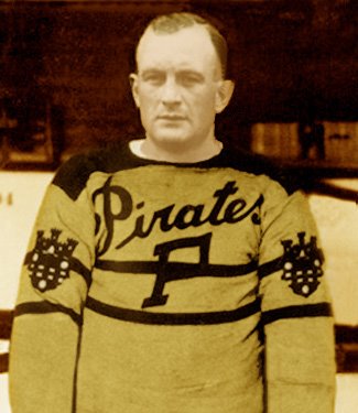
4. Pittsburgh Pirates' Yellow with Black Lines, 1925-1928: The hockey jersey's color and design are both atrocious.
5. Chicago Staleys' Blue and Yellow, 1921: The uniform that the Staleys (now the Chicago Bears) wore for the 1921 season does the vertical stripe an injustice.
6. Cleveland Cavaliers' Red and Gold, 1981-1984: This uniform is in the wrong place at the wrong time.
7. Vancouver Canucks' Yellow, Red, and Black, 1978-1985: The "V" on this uniform does not stand for victory. The color scheme is atrocious.
8. Providence Steam Roller's Black and Orange, 1928: This football team did not last long and neither did its uniform.
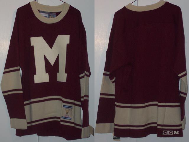
9. Pittsburgh Pirates' Gold with Black Stripes, 1933-1934: The Pirates were the forerunners of the NFL's Pittsburgh Steelers. This is one uniform that does not look good in stripes.
10. Seattle Mariners' Blue and White, 1977-1981: This home uniform gets two thumbs down from me. The color scheme is bad, but the logo is even worse.
11. Chicago Blackhawks' Tan, Red, and Chocolate, 1935-1937: The pattern and colors might be great for a throw rug but not for a hockey uniform.
12. Chicago White Sox's Red, White, and Blue, 1984: This uniform is great--for laughs.
13. Philadelphia 76ers' Blue with White Lettering, 1966-1970: Some uniforms achieve perfection by keeping things simple, but not this one.
14. Iowa Barnstormers' Black and Gold, 1995-2000: Some people might be fond of the various logos imprinted on the Arena League team's uniform. I find them to be kind of tacky. The organization apparently agrees with me. It removed the wings and helicopter propeller from the outfit in 2008.
15. Montreal Maroons' White and Maroon, 1935-1938: This hockey uniform may have been stylish in the 1930s, but it receives a poor grade from me.
16. Boston Red Sox's Red and White, 1907-1910: The color scheme is OK. However, the stocking in the chest area is an epic fail.
17. Hamilton Tigers' Yellow and Black Stripes, 1920-1921: Yet another team that commits a uniform faux passé by choosing a poorly considered striped pattern.
18. Washington Redskins' Red, White, and Brown, 1948: The reddish top does not go well with the yellowish-brown pants.
19. Chicago Cardinals' Brown and Red, 1921-1922: This uniform's red and brown color scheme is drab and unimaginative. The pants come up a bit too high as well.
20. St. Louis Blues' Red and Blue, 1995-1998: Blue and red do not always go well together.
21. Washington Nationals' White, 1924: Where are the colors?
22. Washington (Bullets) Wizards' Blue, Red, and White, mid-1980s: This one is a dud.
23. Colorado Rockies' Blue, Yellow, and Red, 1977-1982: Colorado was once home to an NHL team called the Rockies (now the New Jersey Devils). The squad's home uniform leaves something to be desired.
24. Montreal Allouettes' Red and White, 1946-1969: This uniform does not score many style points with me.
25. Toronto Argonauts' White with a Touch of Blue and Black, 1976-1988: The Argonauts' away uniform is a yawner.
Sources:
The Grid Iron Uniform Database
NBA.com
The Hockey Uniform Database
The author is an avid sports fan. His favorite teams are the Pittsburgh Steelers (in football) and the Atlanta Braves (in baseball).
-- Anthony Hopper
#sports #sportshistory #history #baseball #MLB #football #NFL #basketball #AFL #NBA #hockey #NHL
No comments:
Post a Comment